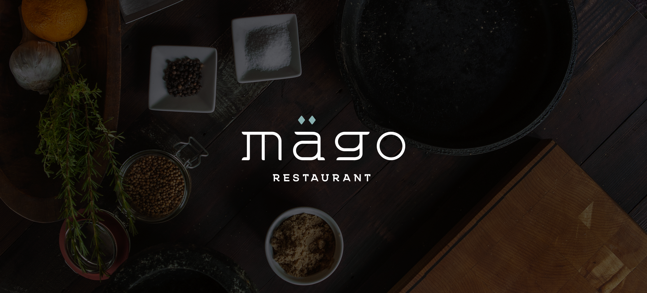
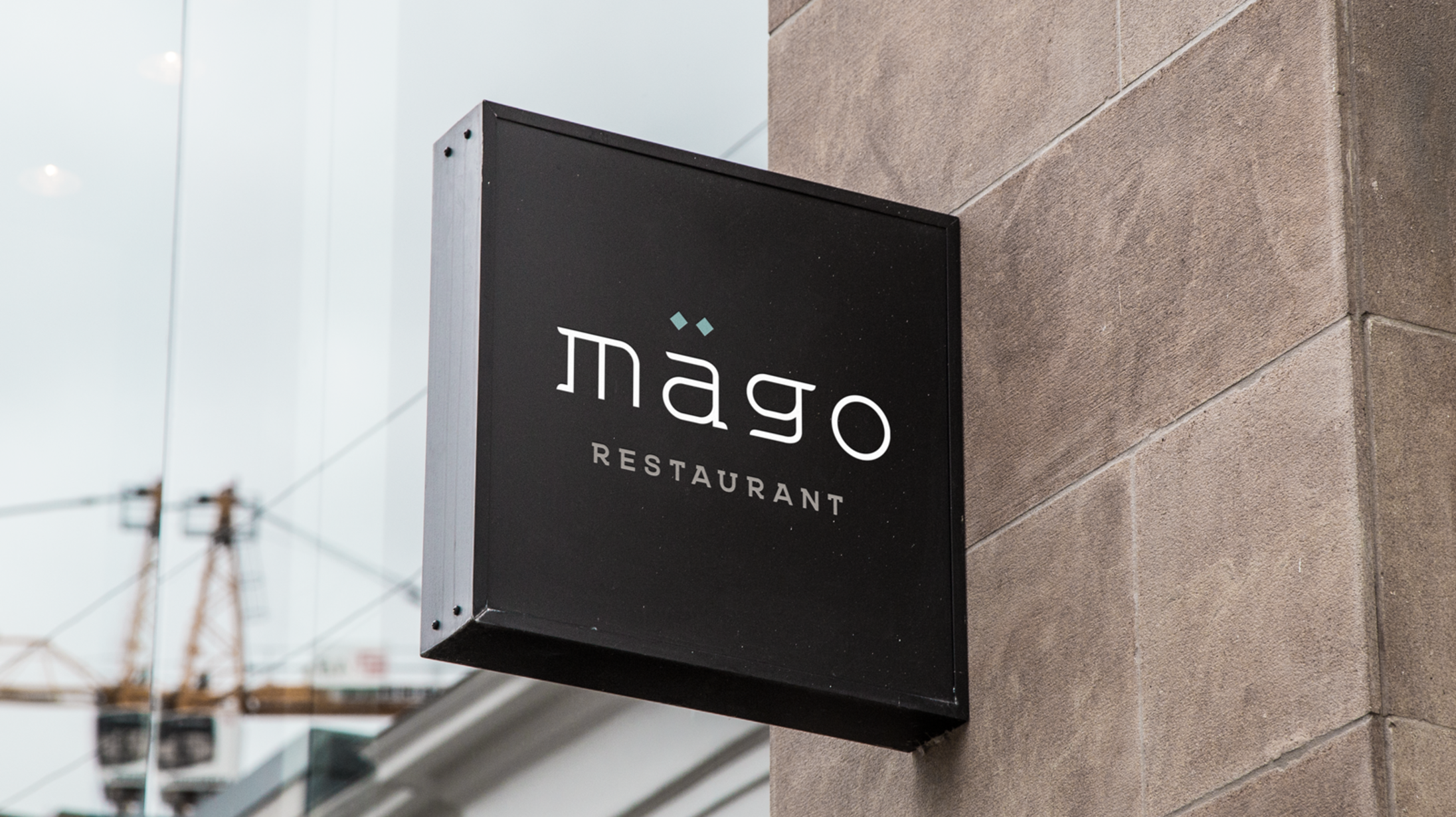
Mägo Restaurant
Mago is simply translated as “magician” and is a nickname that Chef Mark Liberman picked up during his culinary career. Through close partnership with Chef Liberman, I was able to create a brand which captures his culinary wizardry and embodies his new chef-driven restaurant concept which is opening soon.
52 Seasonal Cuisine
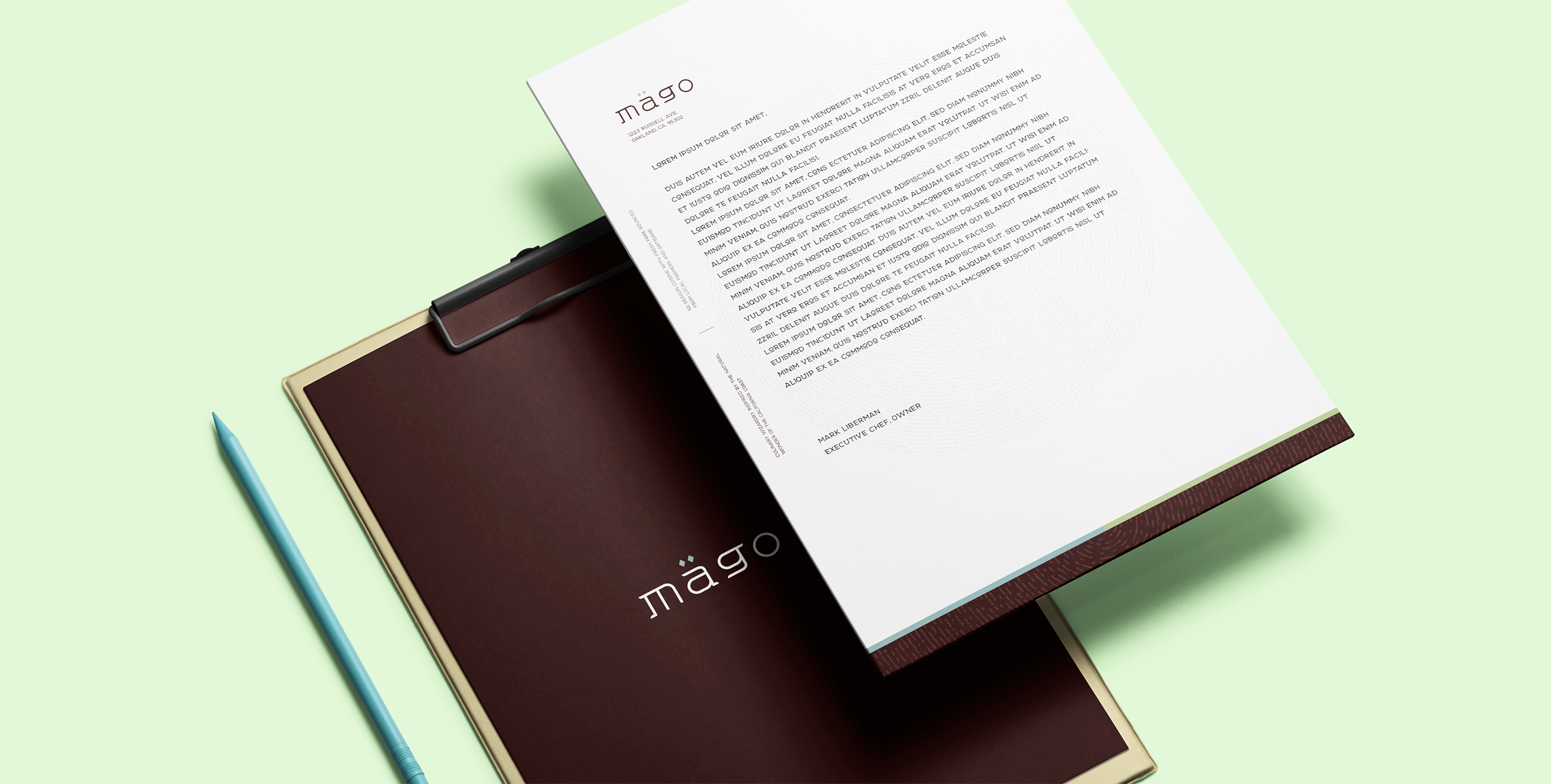
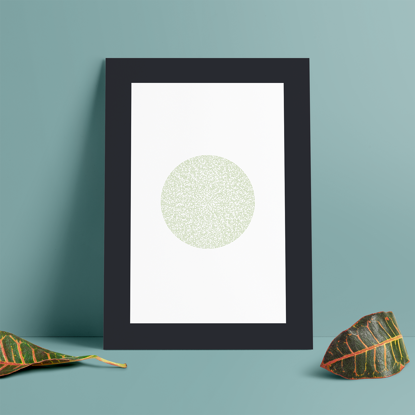
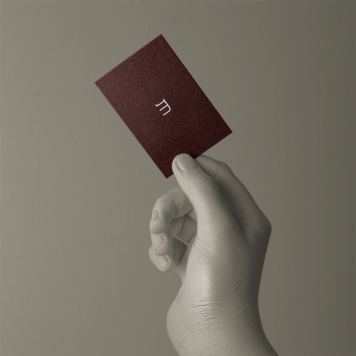
Usually, the best cuisine is very much inspired by what ingredients are in season. Living and working in Northern California, Chef Mark has been surrounded by some of the very best from land and sea. The 52 seasons cuisine is conveyed through 52 rings of the tree which is a familiar cooking medium and symbol of the chef’s kitchen. The rings are used sparingly and becomes a subtle yet critical characteristic of the brand.
Culinary wizardry inspired by the wonder of the California coast
Approachable
An unassuming lowercase lock-up expresses a cuisine which is bold yet approachable even for the casual diner. It was important that the brand appealed to the most seasoned foodies and the average diner walking by the restaurant.

Palette
The brand colors are inspired by the story of how the purity of nature meets the dining table. The Mago brand conveys the blending of Northern California city life with the natural beauty of the Pacific coast.
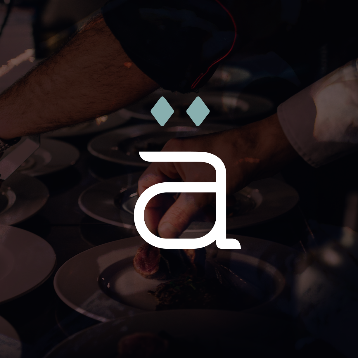
Magic
The element of improvisation and culinary wizardry can be conveyed through the serifs of each letter and the abstraction of the mythical dragon in the Mago “g”. Infusing small touches of magic, fire and fauna are all hinted elements within the set.